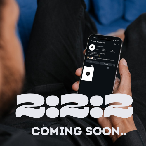

222 Collective
project in progress
Brand Identity & Visual Direction
Client: Caelin, founder
Location: Austin, TX
Scope: Brand Strategy, Visual Identity, Logo Develoment &
Messaging Framework
Caelin came to me at a pivotal moment in her business.
As the founder of an Austin-based marketing studio working with clients nationwide, she was scaling, but her brand hadn’t caught up to her vision. She’s not just a marketer. She’s a musician. A creative. A storyteller. And she wanted her positioning to reflect that layered identity.
More importantly, she wanted to refine her niche - working with fellow creatives and aligning herself more intentionally within the industry.
Our work began with naming.
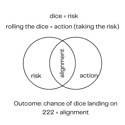
Rather than inventing something trendy or abstract, we grounded her new brand in something deeply personal. Caelin has a small “222” tattoo she got in Bozeman, Montana, at the very beginning of her journey as a full-time musician. It marked the moment before she took a defining risk: quitting her job, stepping into uncertainty, and building something of her own.
For her, 222 represents alignment in motion. The quiet confirmation that you’re exactly where you’re meant to be, even when the leap feels terrifying.
That meaning became the foundation of the brand. What started as a personal symbol evolved into a strategic identity, rooted in risk, alignment, and creative courage.
The Process
After naming the brand, we moved into a deep strategic dive.
We explored the intersection of music, marketing, and identity, defining her ideal clients, and clarifying the emotional experience she wanted them to feel. We unpacked what 222 meant to her beyond aesthetics, symbolism, and trend.
Through that process, one theme kept resurfacing: risk, alignment, and story.
222 represented synchronicity. the precise moment when risk meets action. The next step was to identify a symbol that could hold all of that meaning at once: action, risk, and alignment. All distilled into something visual, simple, and powerful.
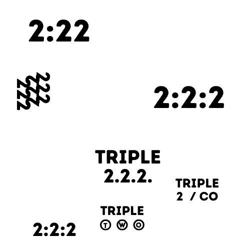
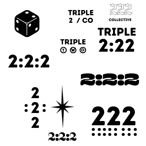
Visual Direction
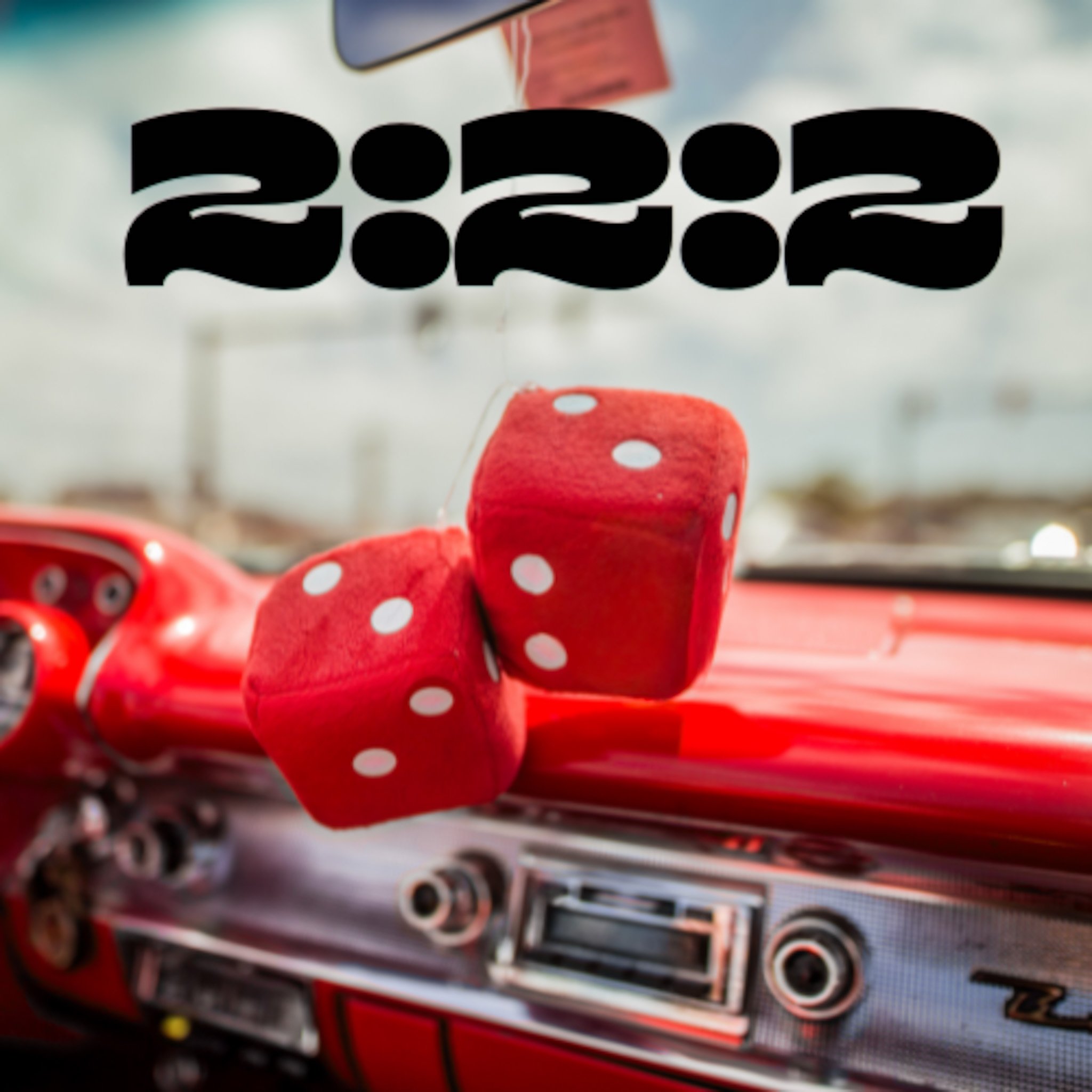
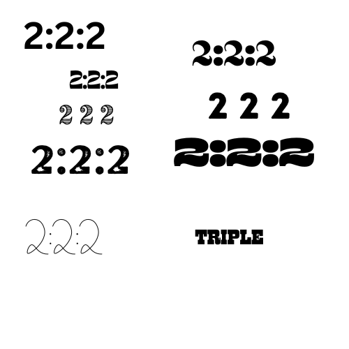
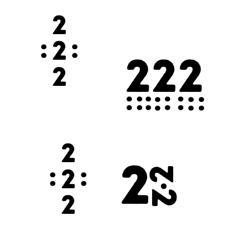
I began looking at 2:2:2 as a visual system. When read with separators, it subtly mirrors the structure of an analog clock representing a moment in time. That reinforced the idea that alignment isn’t random; it’s timing. The dots between symbolic pauses, markers of movement, beats between decisions.
The typography followed the same philosophy.
The text needed to feel bold yet uniform, structured but confident. We chose typography that felt grounded and balanced, reflecting alignment through consistent weight and spacing, while the overall mark still carried the tension of risk.

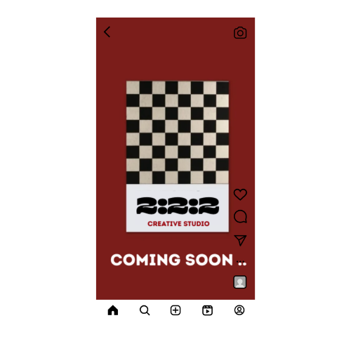
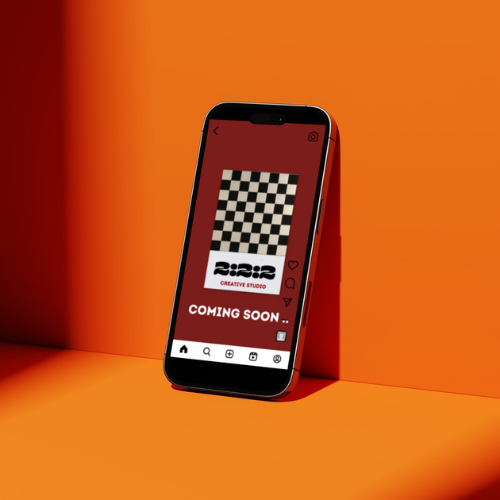
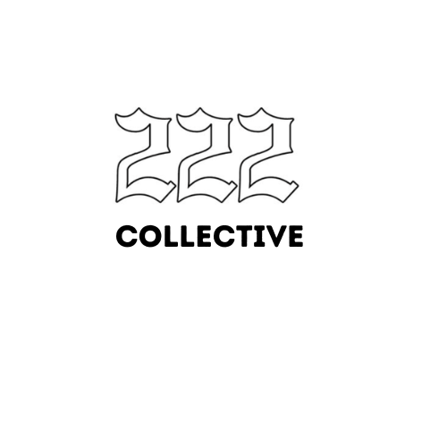
Final Logotype
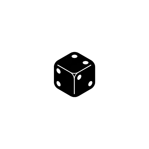
Brand Icon
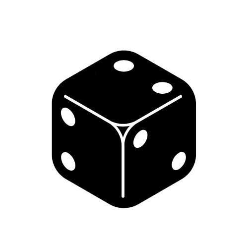
Dice represent risk. They're the decision to move forward without certainty, which aligned directly with Caelin's belief in creative courage and calculated leaps, both in business and music.
Each visible face carries the number two, turning 222 into a dimensional form. Three sides, three twos, alignment expressed across multiple planes.
Repetition creates order from chance. Risk and structure, held in tension.
The mark feels bold and simple, but it's rooted in the concept of the original brand identity: risk, action, alignment.